As we spend a lot of our time working on presentations, we often hear people’s frustration with PowerPoint. Don’t get us wrong, we do think the software has assumed a way of working to make it user friendly; with the title field, bullets, clip art, and bulky shapes. However, many businesses, including Amazon, do tend to blame the tool rather than the user.
This blog is to encourage us all to look past the standard layouts and break the rules a little. We need to always ask ourselves ‘is there a better way to display this content?’ – in a bid to create more effective presentations.
Let’s take a look at a quick example:
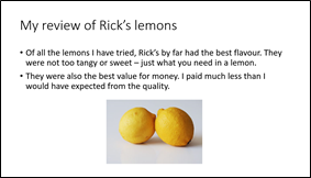
This slide about Rick’s lemons is what many of us have come to recognise as a typical PowerPoint layout. It’s built using the default template, with a classic title, sentence bullet points, and a JPEG image with a background. Adding a visual is a positive as it supports the narrative, but the text encourages you to read, rather than listen, and you’re left searching for the key points.
How can I improve this slide?
We don’t need to do much to turn this into a more compelling slide. Firstly, we can simplify the text and amplify the message. Be brave – less is more. Spending time to think about the words we use to articulate the key points can be the difference between a sleepy audience and an engaged one.
Secondly, the image. There are many ways that you can find a good image, including PowerPoint’s own collection and Creative Commons license (we’ll be sharing some resources on this in a later blog!). In this case we would look for images that are isolated on white, so they blend easily with the background.
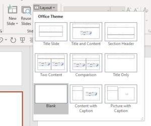
Lastly, let’s break free from the default layout. Move our title position and increase our font size to give the message presence, impact and space.
Have a look at the new and improved version, below:
At the end of the day, you should be proud of your slides. By taking the time to think of PowerPoint as more than what we have come to expect, we can think of the potential it can offer for the stories we tell. So next time you’re sitting down to create a presentation, start with a blank layout with no title or bullets. Think beyond the box in a quest for more compelling, memorable and stand out presentation.
Please email us at studio@maxwellrogers.co.uk if you want to discover more about effective presentations and great story telling. And keep your eyes peeled for more posts in our A to Z of effective presentations blog series.


