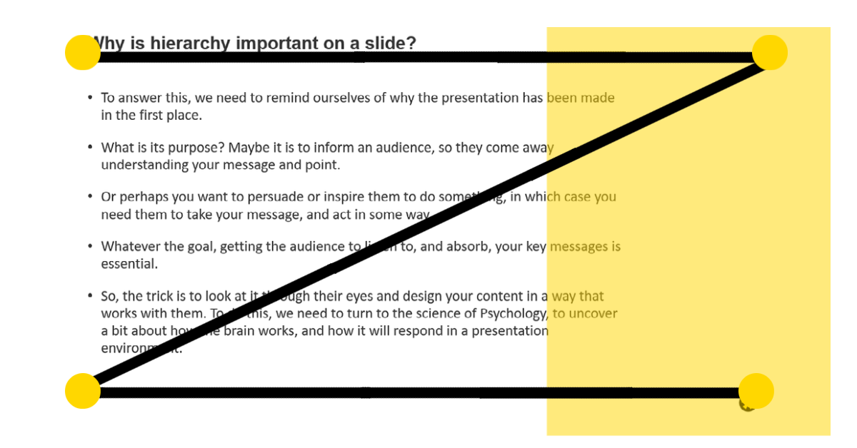
Why is hierarchy important on a slide? To answer this, we need to remind ourselves of why the presentation has been made in the first place. What is its purpose? Maybe it is to inform an audience, so they come away understanding your message and point. Or perhaps you want to persuade or inspire them to do something. Whatever the goal, getting the audience to listen to, and absorb, your key points is essential. But, with our attention spans getting shorter and shorter (a study by Microsoft in 2015 suggested it could be only 8 seconds!), this is becoming much harder. That’s why hierarchy, the order and layout of your content, is so important, to funnel attention to your main points so they are understood and processed by your audience. Read on for our tips on how to leverage hierarchy in your presentations.
Critique your slide
The first thing we suggest is to streamline your slide to the most relevant points. This is, in part, due to the theory of dual modality – where our brains struggle to listen to someone speak whilst trying to read at the same time (to find out more, read our blog on cognitive loading). To avoid this, you need to cut words on the slide to the bare minimum, then talk around it with your narrative. Make sure you also present the most important points first, so they don’t get lost in the rest of the content. That way you’ve clearly shown the audience what the key takeaways are and managed to keep their attention for longer by directing to the main points, whilst reinforcing with a verbal explanation.
Positioning
Another thing you can do to draw attention where you want it is to put the most important points at the top left-hand side of the slide. This is mainly relevant for languages that use left-to-right script, as the brain has been conditioned to focus on this area first. Eye movement studies suggest the eyes scan the page in a “Z” shape, going from top left to top right, to bottom left, then finishing at the bottom right-hand side.

This suggests we should have important information top left, and a call-to-action bottom right. When you’re designing your slide, take this into account. Put the main points first, but remember you can be creative with it. Consider eye movements and make the most of the space you have. Too many people default to using the classic PowerPoint template of a title and list of bullet points, which neglects the whole of the right-hand side. When considering the Z-shaped pattern, you’re missing out on a huge area of valuable space.
Use visual features to help elements stand out
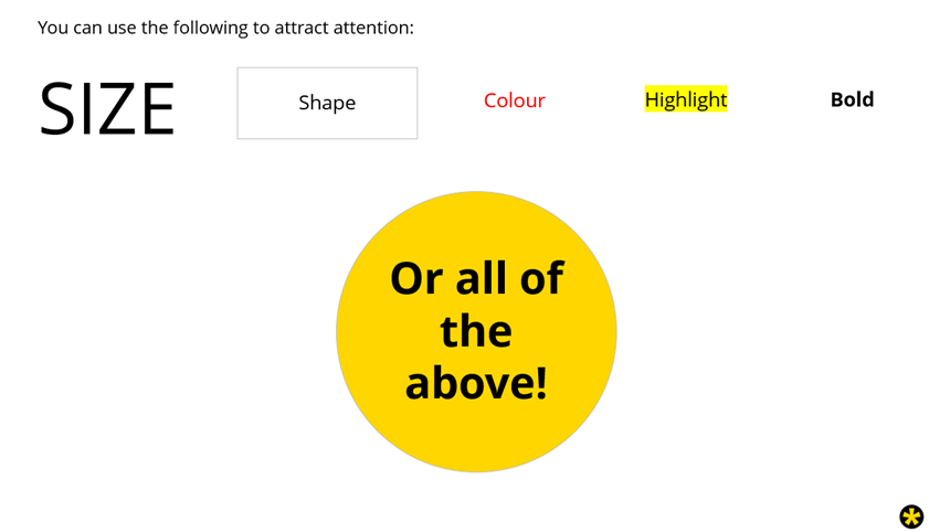
Our third tip is a relatively obvious one. Draw attention using size, shape, colour, highlight, or even just by boldening the text. Anything that will make it stand out amongst the rest of the slide.
Animation
Sometimes your slide may still be complex, even after you’ve attempted to cut it down. In this case, you can always use some simple animation to guide focus throughout. We’re not saying you should go wild using PowerPoint’s different styles (nobody needs to see your text bounce in). Instead, just use a simple “fade” or “fly” animation to introduce one point at a time. Chopping a complex message into small, digestible chunks like this, can be very useful in clarifying the message.
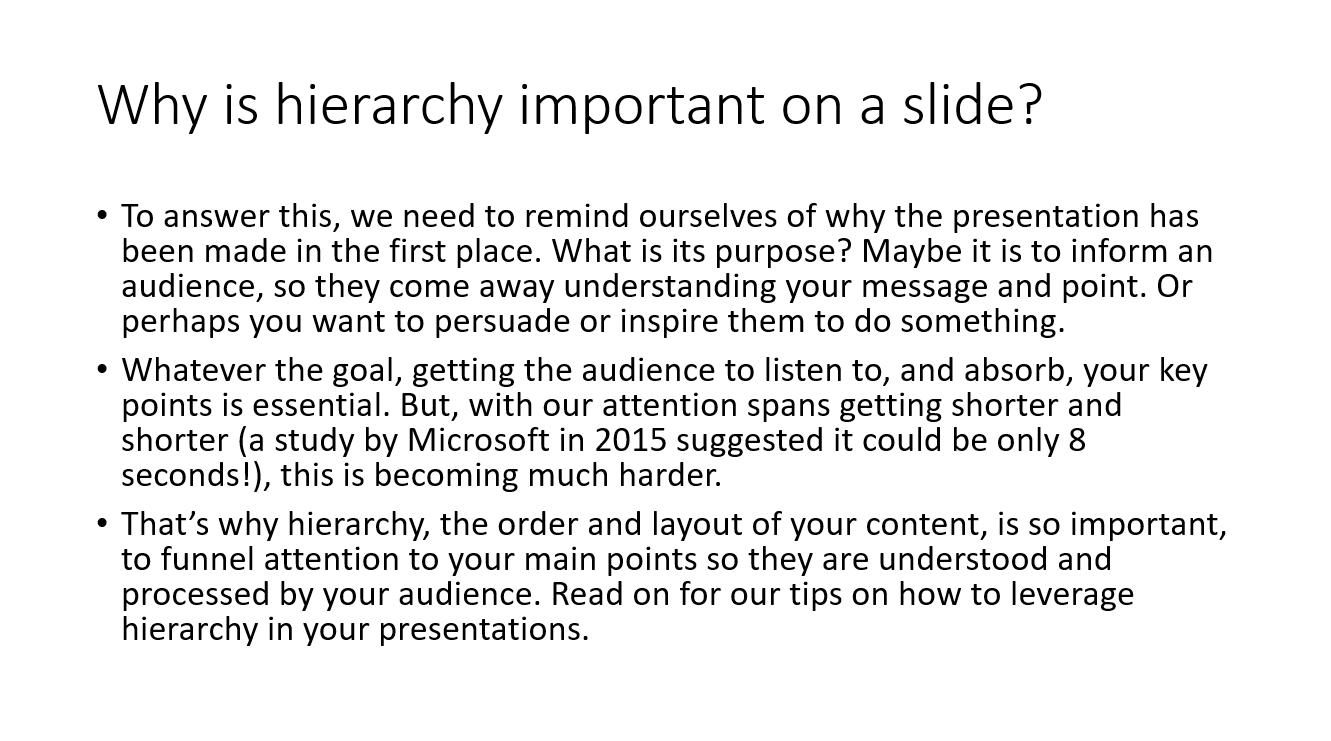
So those are our tips on how to leverage hierarchy to help your audience process and understand your key messages. Take a look at some examples below to see them in action. On the first slide there is just a paragraph of text. It looks hugely overwhelming, and it is not obvious as to what the main points are. The chances are the audience would be struggling to concentrate enough to read it all, and if they did manage to reach the end, it is unclear what the key takeaways are. Plus, if the presenter’s talking as well, the audience would likely struggle to read and listen at the same time.
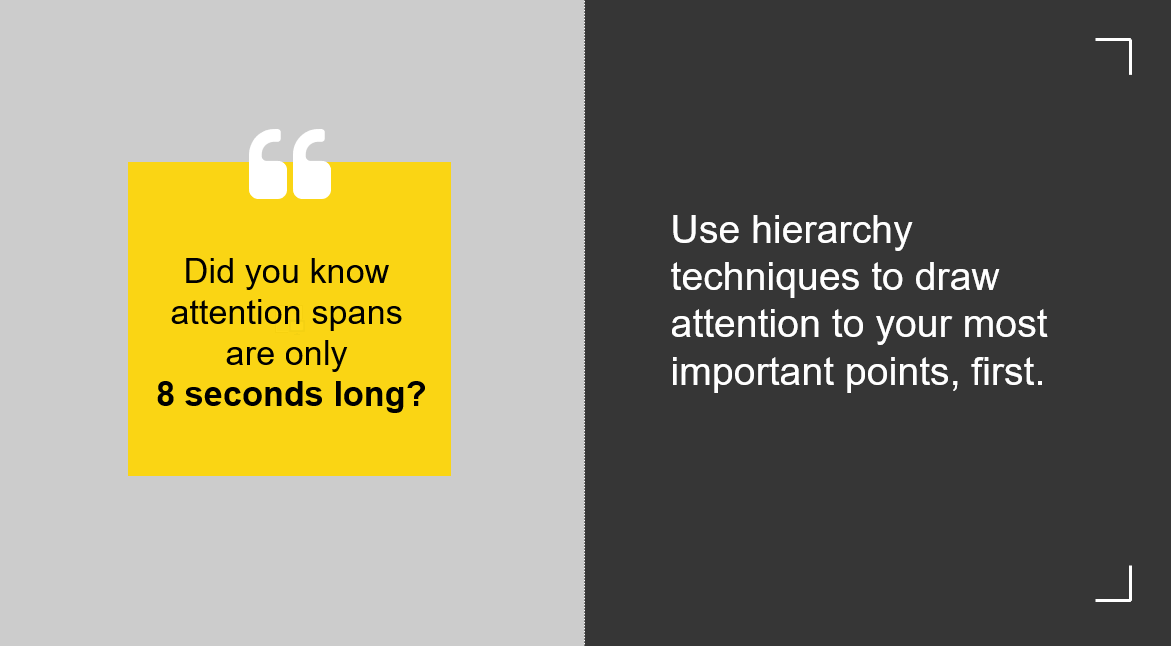
On the second slide, however, there is a much clearer hierarchy. The text is minimal and only takes about five seconds to read. This is well within the average attention span, and with plenty of time to listen to the narrator elaborate. It is also clear from the start what the main messages are, as they are not hidden within superfluous sentences, but are highlighted with colour and size.
Slide examples
So, to conclude, we should be approaching each slide with the same narrative techniques we use to map out the whole deck; deciding on the main points, cutting out anything that may be irrelevant, and guiding the audience through the rest. Doing this will make your slides clear and engaging and ensure the audience understands what you want them to. If you would like some help with your business communications, please get in touch at studio@maxwellrogers.co.uk. Or if you want to read more about how to craft effective business presentations, check out our blog series.