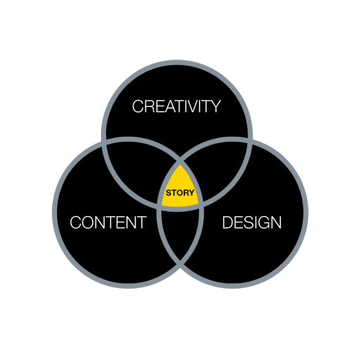
When it comes to good storytelling, design is one of three major components that contribute to the effectiveness of presentations.
It is similar to slide visualisation: how we represent and lay out content in more meaningful, graphical and engaging ways. However, it is so much more than just aesthetics – it influences how we process information. According to Brown, “We are neurologically wired with an overwhelmingly visual sensory ability”. So, even if our audience isn’t super interested in our subject matter, presenting information visually should help increase their engagement. It can also help improve the extent to which people understand or remember our content, as we discuss below:
Better memorability
A psychological phenomenon called the picture superiority effect shows how visuals often improve memorability. When participants are asked to remember a series of information, several studies have shown that recall is much more accurate when the information is presented visually, as opposed to written text. Researchers have suggested that this is because images are coded in our long term memory to a greater extent than words are.
Better understanding
Research by Levie and Lentz also found that in 98% of studies, illustrations significantly increased participants’ understanding of content. The researchers explain that the visuals help provide spatial context for the words, and signpost key points of the argument, which improve comprehension.
Another theory also suggests that visuals can aid understanding through a process called the modality effect. According to the working memory model, when we process spoken and written word, a part of our brain called the phonological loop is activated. When we receive visual information, it is processed in an area of the brain known as the visuospatial sketchpad. These systems are largely independent of each other, and each have limited storage capacity.
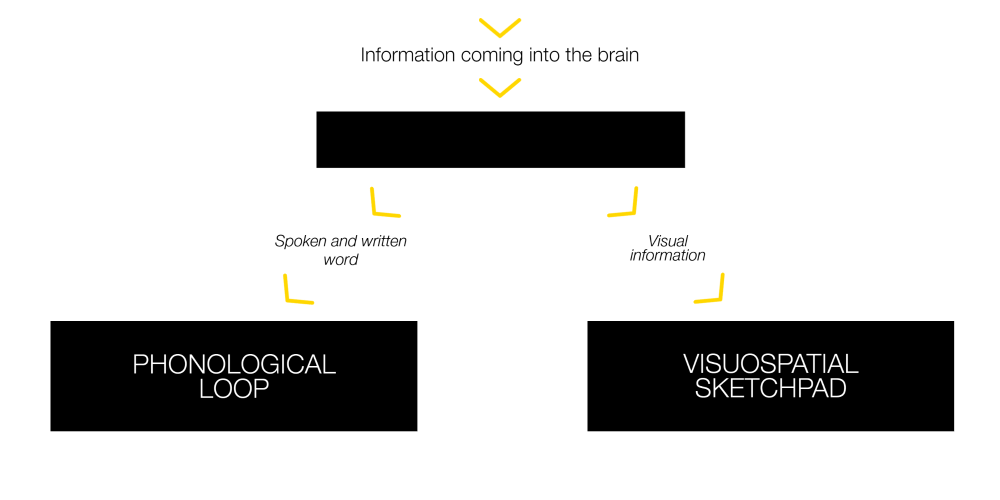
This is a great bit of insight for our presentations. Say you’re showing a slide filled with text, and are also explaining the content in your own words at the same time. Both forms of communication will be processed using the phonological loop. This will likely overload it with too much information, leading to the audience getting confused or “zoning out”.
Now, if you are showing an image, and explaining it verbally, these forms of communication use different systems – the visuospatial sketchpad and phonological loop respectively. In this case, each is less likely to become overloaded, and there is a greater chance the information will be processed correctly. It links closely with our article on cognitive load, which explains how our brains cannot process too much information at once.
Conclusion
In conclusion, by making your slides more visual and incorporating images, graphics, or icons, you have a much better chance of engaging with your audience. There is also a higher probability that they will be able to recall what you presented.
We must remember, however, that relevance is key. It is all too well impressing the audience with design tricks, but if it is not relevant to your message, it defeats the point. In fact, the recall advantages of presenting information visually is reduced if it does not match the content you are presenting, and we do not remember decorative images as well as we do informative ones.
For more tips on design, including how to use effective images, and present data visually, follow us on LinkedIn and Instagram – we will be posting more blogs throughout the year. For something more practical Our Storytelling Training also deep dives into slide visualisation (please let us know if you’d like to find out more genevieve.lebus@maxwellrogers.co.uk).
References
Brown, S. Doodle revolution : unlock the power to think differently. New York: Portfolio/Penguin.
Curran, T., & Doyle, J. (2011). Picture Superiority Doubly Dissociates the ERP Correlates of Recollection and Familiarity. Journal Of Cognitive Neuroscience, 23(5), 1247-1262. doi: 10.1162/jocn.2010.21464
Harp, Shannon F., and Richard E. Meyer. “The Role of Interest in Learning from Scientific Text and Illustrations: On the Distinction Between Emotional Interest and Cognitive Interest.” Journal of Educational Psychology 89.1 (1997): 92-102. Education Source. Web.
Levie, W. Howard, and Lentz, Richard. “Effects of Text Illustrations: A Review of the Research.” ECTJ30.4 (1982): 195-232. Education Source. Web. 15 Dec. 2015.
Paivio, A. (1979). Imagery and verbal processes. Hillsdale (N.J.): Lawrence Erlbaum Associates.
What is “Good” Design? A quick look at Dieter Rams’ Ten Principles. (2021). Retrieved 5 March 2021, from https://designmuseum.org/discover-design/all-stories/what-is-good-design-a-quick-look-at-dieter-rams-ten-principles