For most business presentations, graphs are a necessity, and at Maxwell Rogers, we use them a lot when crafting decks for our clients. They are hugely useful as they allow you to display complex information in a simple way, and have a number of other key benefits, too.
Firstly, your audience is more likely to understand your point if it is presented clearly and visually. So, rather than displaying a list of numbers and telling everyone there is a trend, you should put the data in a graph and show the trend instead.
Then, if they understand it better, they’re more likely to engage with it to a greater extent, too. At the end of the day, you are probably presenting to these people because you want them to do something – perhaps get to grips with the latest sales figures, show support for your new strategy, or even invest in your product, service, or idea. So, anything that helps increase engagement will play in your favour.
For your graphs to tick all these boxes, however, they need to be done well. This article will explain ways in which you can help make your graphs look clear, engaging, and professional.
Use the right graph
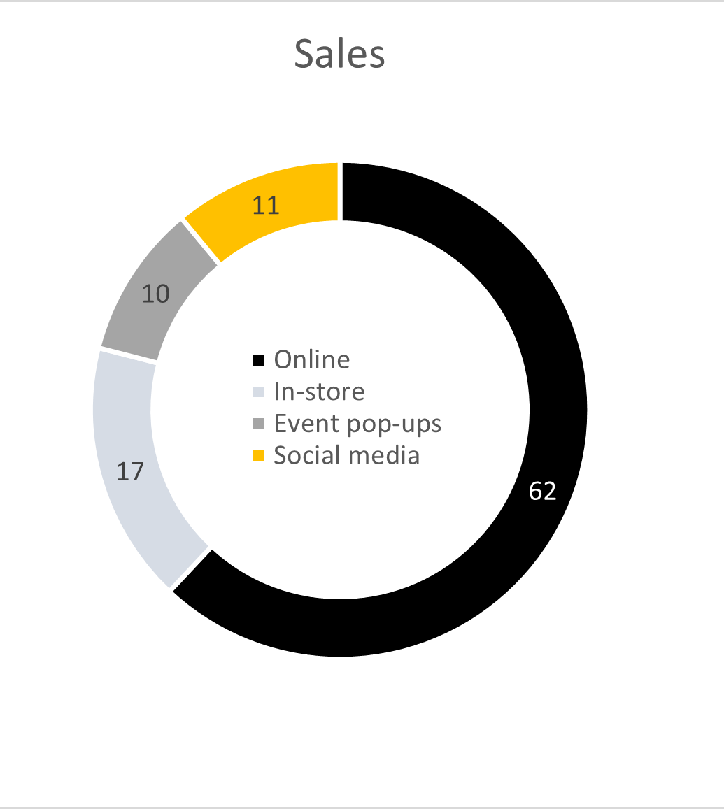
This may seem obvious, but most people default to one or two graphs that they use again and again, without exploring the alternatives. And this is fine if the graph you use is the best way to present the data you have, but it is worth having a look through the (many) options PowerPoint provides, to make sure you’re using the most relevant one. For example, the classic pie chart is often chosen. But did you know it can also be presented in a doughnut shape? This may be a neater alternative and allow you to save space if you put elements of the key in the centre.
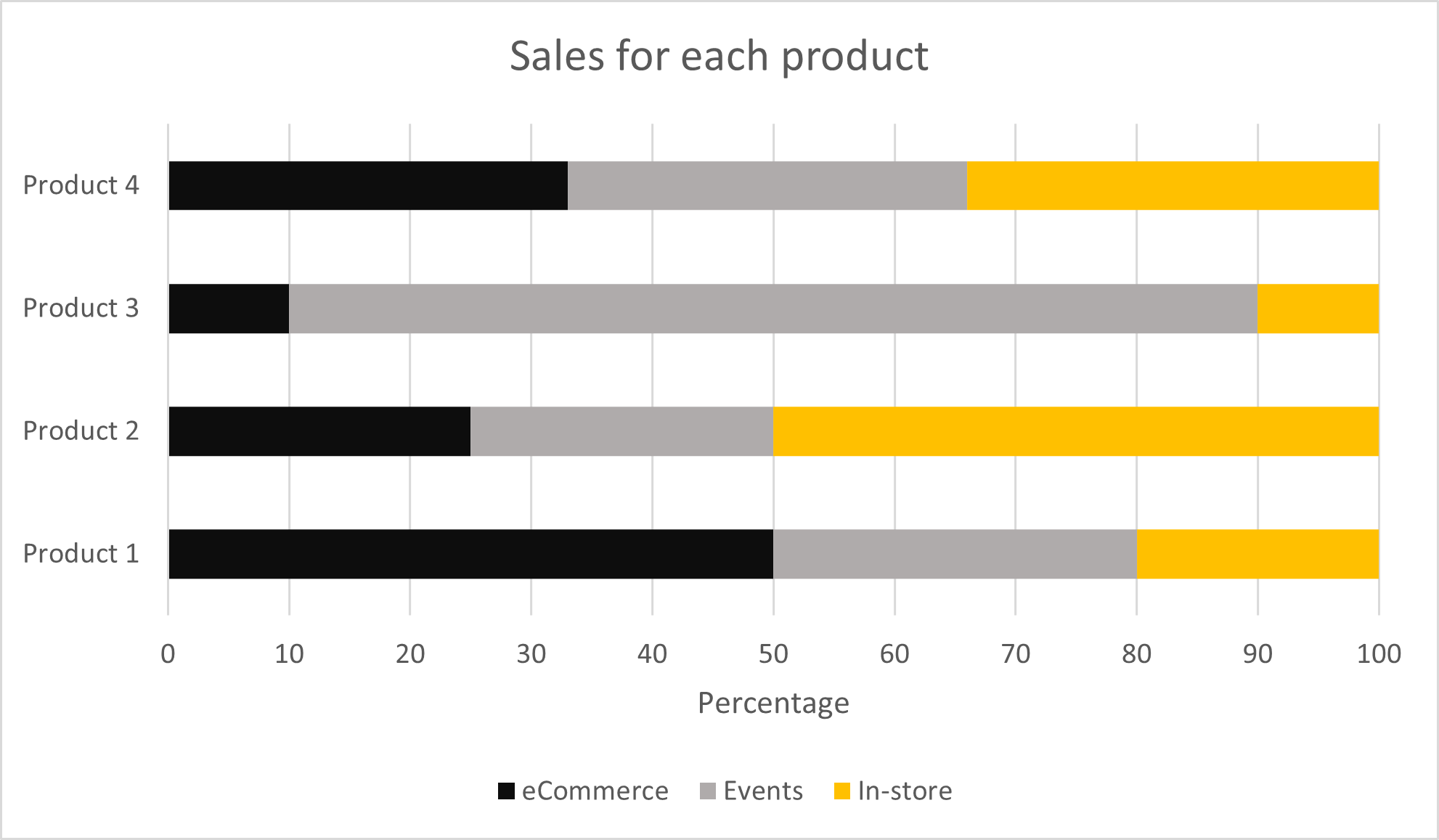
Or, alternatively, you could use a stacked bar chart. This shows the numbers as a percentage of a whole in a completely different way. it also allows you to compare against other items.
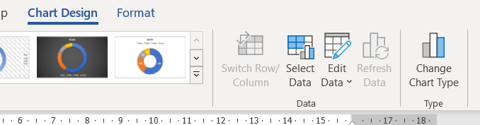
The best type of chart to use will depend on the data you have, so click on INSERT-CHART and familiarize yourself with the options. And don’t worry if you choose one type and realise it would look better as another. All you need to do is click on your graph and select “chart design” from your toolbar at the top of the screen. Then, click “change chart type” on the right-hand side and voila – you’re good to go!
Only show what is relevant
This is really important. If you’re showing how sales have increased in the past quarter, you don’t need to insert a graph with data stretching back five years, unless you reference all this context in your message. Too much information distracts from your point, makes the chart look overly complex, and reduces the clarity and impact of the important data on the screen.
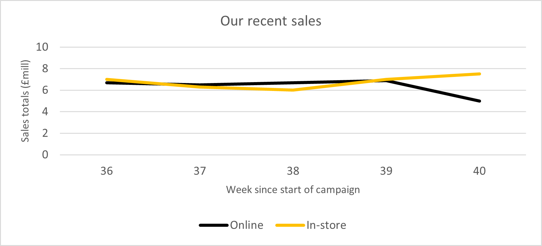
Instead, maybe just include the last year’s data for context. Or, if you’re showing how Q1 this year is different from Q1 last year, just display these data points, not the bits in between. See the example below, used to describe the sales over the past month. In the first graph there is a lot of unnecessary data which takes away from the point you’re making. In fact, when you strip out all the extra numbers, the graph shows a very different story. So, make sure you’re only showing the data you need to.

Customise it
And finally, when you have made your graph, remember that you don’t need to keep the default settings. Swap the colours to match your brand by double clicking on the line, bar or pie section and right clicking.
Or, delete some of the elements to increase clarity. You’ll need to make sure your audience understand every part, but you do have some flexibility in how you present it. For example, why not remove the numbers from the y axis of a bar chart and display the totals at the top of each bar instead? Double click the axis you want to get rid of and delete. Then, right click on an individual bar and select “add data labels”.
 For even more customization, click on an axis and right click, selecting “Format axis”. A panel will appear on the right-hand side of your screen. By clicking “axis options” on the top left-hand side, then selecting the bar graph icon on the right, it gives you the option to change the axis type, tick marks, label positions and maximum and minimum axis values.
Don’t forget that you can also very easily change the font and size of titles and labels by double clicking on each individual element and you can adjust the position simply by dragging it.

We hope this article has been useful in giving you an introduction to what’s possible with PowerPoint’s very flexible graph features. By making these subtle changes, you can elevate your data to look much more professional. Now, you need to play around with some of the tools we’ve highlighted and see what works best for you. If you have any questions or want to know how we can help you create presentations that impress, please get in touch at studio@maxwellrogers.co.uk.